01 — Branding · Packaging/CONCEPT PROJECT/2026
CONCEPT PROJECT
MERIDIA
Identity for a botanical skincare house — a quiet, editorial luxury system built on restraint.
OVERVIEW
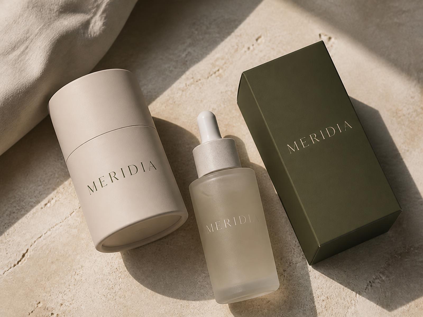
Meridia is a conceptual botanical skincare brand. The exercise: build a premium identity that whispers instead of shouting, where the packaging does the talking and the typography stays out of the way.
DELIVERABLES
- Brand concept
- Logotype & symbol
- Typographic system
- Colour system
- Primary packaging
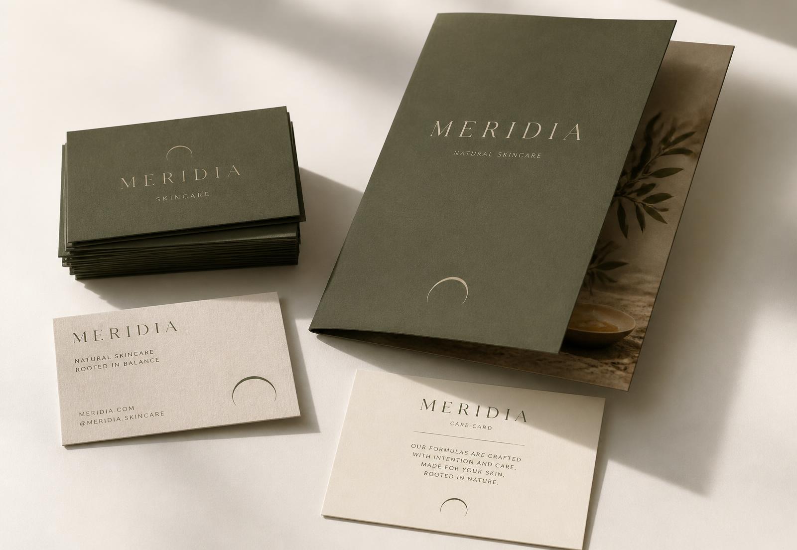
- Stationery
PALETTE
- Sand#D9CEBF
- Olive#4A5341
- Bone#F2EEE7
- Clay#8A7D6B
CREATIVE CONCEPT
Balance, taken literally. The wordmark sits on a wide, even baseline and the crescent symbol references the meridian — the moment of equilibrium in a day. Everything in the system is built from that single idea of calm proportion.
IDENTITY & TYPOGRAPHY
A high-contrast serif with generous letter-spacing carries the name; a small all-caps grotesk handles product and care information. Two voices, never competing.
APPLICATIONS
Uncoated stocks, soft-touch cartons and foil detailing. The system is designed to be recognised on a shelf from two metres away by silhouette and colour alone.
Self-initiated concept created to demonstrate Norte's approach to strategy, UX/UI, and conversion. Not commissioned by the featured brand.