02 — Branding · Signage/CONCEPT PROJECT/2026
CONCEPT PROJECT
KIOSKO
A loud, street-level food brand: maximum contrast, minimum budget, built to be read at speed.
OVERVIEW
Kiosko is a conceptual street food market brand. The brief we set ourselves: an identity that survives sunlight, grease, cheap printing and a three-second glance from across the street.
DELIVERABLES
- Naming direction
- Logotype
- Colour system
- Pattern system
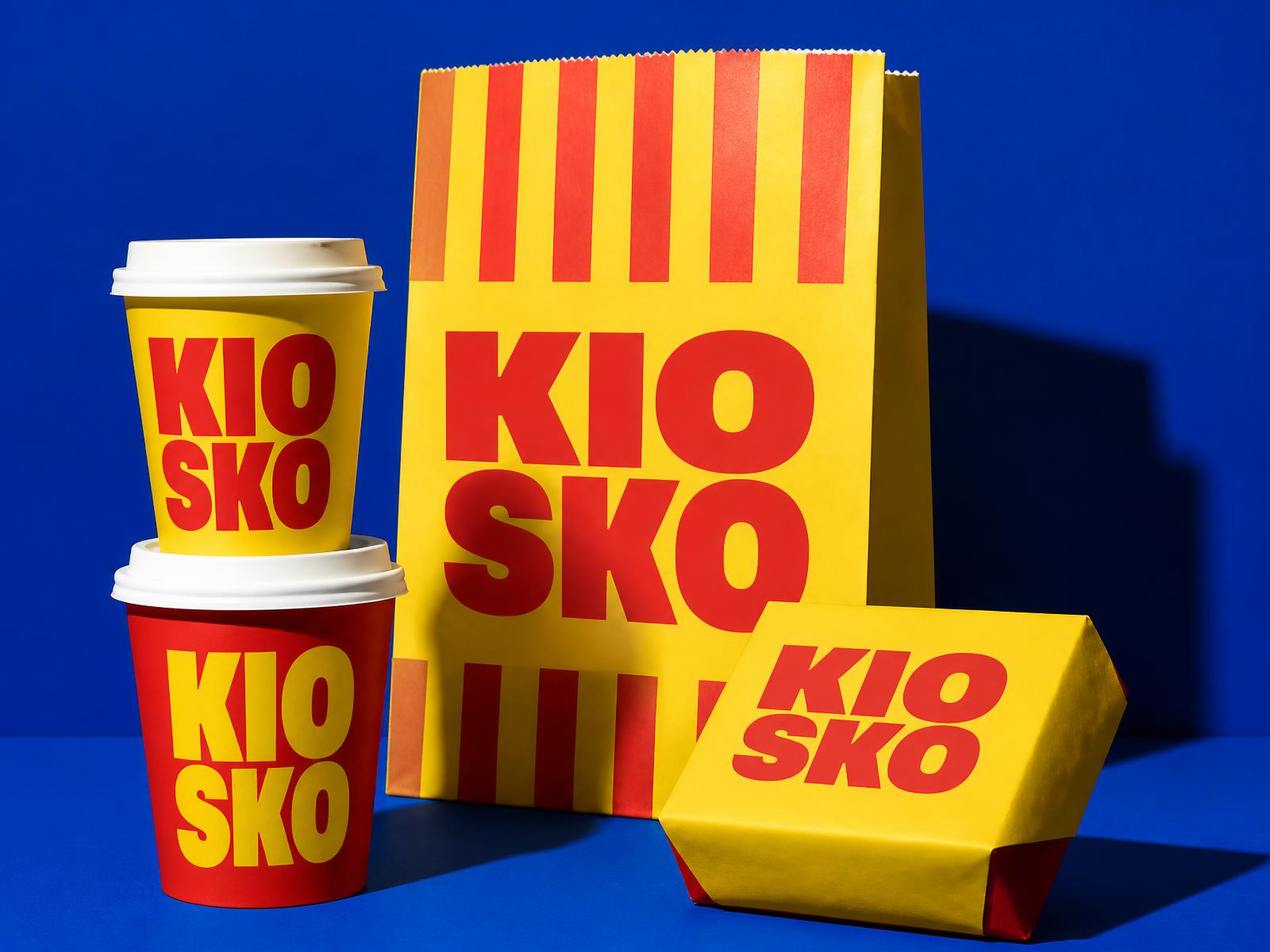
- Packaging range
- Exterior signage
PALETTE
- Signal Yellow#FFD400
- Tomato#E8342A
- Cobalt#0A3BC4
- Ink#141414
CREATIVE CONCEPT
Stacked lettering, two-colour printing, no photography required. The name breaks into two lines so it fits any format — a cup, a bag, an awning, a sign — without redrawing anything.
SIGNAGE & ENVIRONMENT
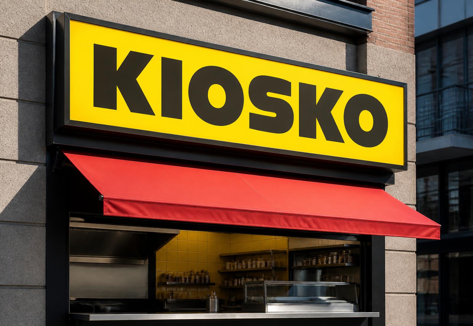
The lightbox is the logo. A single yellow plane, black condensed lettering and a red awning give the stall a silhouette recognisable from the end of the block.
PACKAGING SYSTEM
A stripe pattern derived from the awning ties the whole range together, so any new format only needs stripes plus the stacked wordmark.
Self-initiated concept created to demonstrate Norte's approach to strategy, UX/UI, and conversion. Not commissioned by the featured brand.