03 — Brand Identity · Digital/CONCEPT PROJECT/2026
CONCEPT PROJECT
HALDEN
A precision-engineered identity for a fictional industrial software company — grid, restraint, one accent.
OVERVIEW
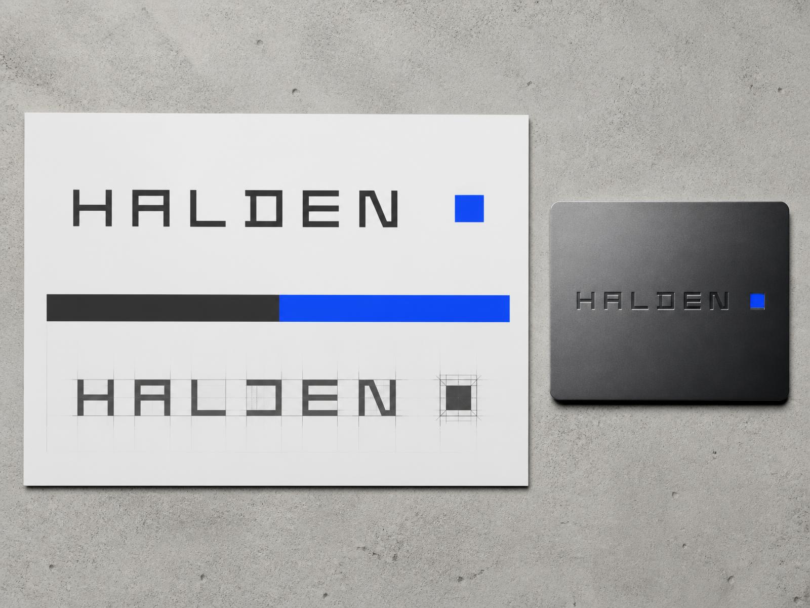
Halden is a conceptual identity for an industrial software company. Every letterform is built on the same modular grid as the product interface, so brand and software share one geometry.
DELIVERABLES
- Logotype & symbol
- Grid construction
- Colour system
- UI colour rules
- Environmental signage
- Brand guidelines
PALETTE
- Graphite#1F2124
- Electric Blue#1B4BF0
- Cool Grey#E9EAEC
- White#FFFFFF
LOGOTYPE CONSTRUCTION
Drawn on a 5-unit grid with flat terminals and a single square counter-shape that doubles as the standalone symbol and the interface loading state.
SYSTEM IN USE
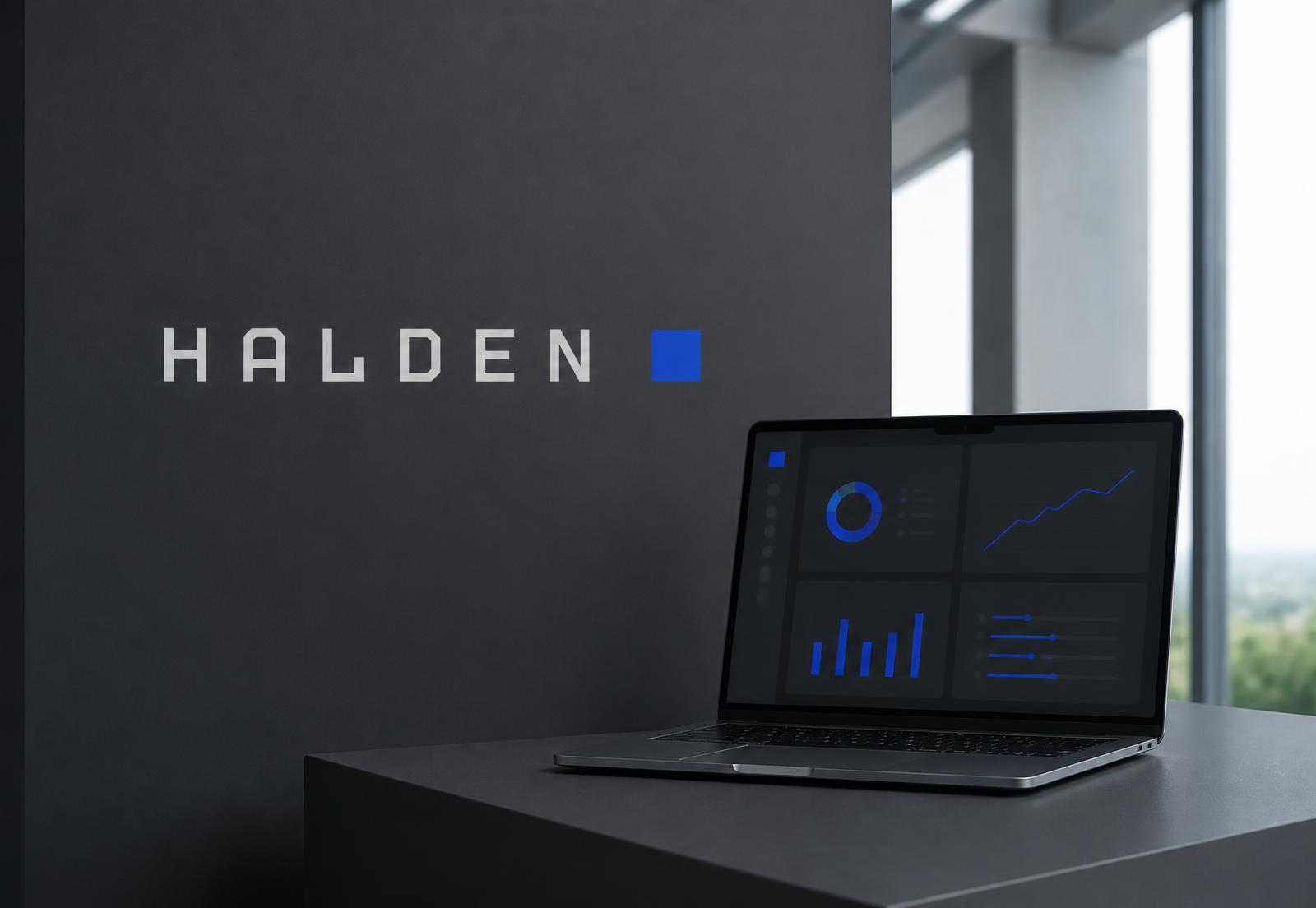
Graphite as the base, cool grey for surfaces, one electric blue used only where the user must act. In the product interface the same rule keeps every screen legible.
Self-initiated concept created to demonstrate Norte's approach to strategy, UX/UI, and conversion. Not commissioned by the featured brand.